Action first
Payment state and the primary action stay visible without requiring horizontal navigation.
The product had been designed primarily for desktop, but most payees were accessing Built from their phones. Inconsistent patterns added friction to the steps required to receive a payment.
I redesigned the full payee journey for mobile, creating responsive, accessible, and reusable patterns across payments, bank accounts, and lien waivers.
The redesign created a simpler path to getting paid and established a stronger foundation for a scalable design system.
The problem
Built’s payment product served two sides of a transaction: payers, who sent payments, and payees, who received them.
The payee experience was especially important because payees needed to complete several critical steps before getting paid: accept a payment, add a bank account, and sign lien waivers.
While the existing experience worked on desktop, most payees were accessing Built from their phones. The desktop-first interface didn’t translate well to smaller screens, and the absence of a mature design system meant patterns and components varied across the journey.
My role
I redesigned the entire payee experience for mobile, working through every screen and state in the existing web flow rather than addressing individual screens one at a time.
My goal was to create a consistent experience that worked across screen sizes while improving usability and accessibility.
Mobile was not a scaled-down desktop table. It needed a new content model that surfaced the next action without losing the payment context.
%201.png)
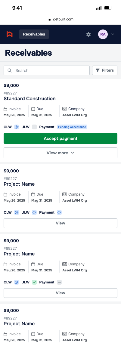
Payment state and the primary action stay visible without requiring horizontal navigation.
Amount, project, invoice, due date, company, and requirements remain scannable in a compact card.
Secondary information is progressively disclosed so each payment remains easy to scan.
Core flow
The redesign connected the steps required to receive money into one coherent mobile flow, with consistent navigation, form patterns, validation, and status messaging from start to finish.
System thinking
I audited the existing payee journey and rebuilt the screens using reusable patterns for navigation, forms, inputs, buttons, status messaging, and responsive layouts.
Rather than optimizing individual screens in isolation, I treated each decision as part of a shared product language—one that could stay consistent as payees moved between payments, banking, and documentation.
A predictable structure kept users oriented while they moved through required tasks.
Repeatable field, validation, and action patterns reduced relearning between flows.
Consistent language and visual treatment clarified what was done and what remained.
Responsive patterns
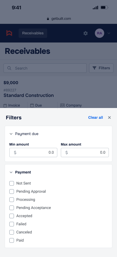
Dense desktop controls became focused mobile interactions. Filters moved into a bottom sheet that preserved context, supported comfortable touch targets, and kept the receivables list available beneath it.
Accessibility
Accessibility was part of the redesign from the start. I improved typography, hierarchy, spacing, touch targets, form patterns, and contrast so the experience remained clear and usable on smaller screens.
These were not finishing touches. They shaped the responsive patterns and component decisions that the broader product could build on.
The outcome
The redesign created a responsive, accessible payee experience across the full payment journey and introduced consistent UI patterns that could be reused as the product evolved.
It also established a stronger foundation for a design system, helping the team move away from designing individual screens toward building with repeatable components and patterns.
For payees, the result was a simpler experience focused on what mattered most: completing the required steps and getting paid.